Natura e Avon
•
Beauty Industry
•
LMS
•
Educational system
•
SaaS
Redesign of educational platform
product design
UI design
usability
Led the improvement of learning experience of Natura resellers through the redesign of the educational platform.



UX Challenge
How to improve the engagement of the users in the platform to increase course completion rate?
CES score (effort): Regular
Course completion rate: decreasing monthly

Context
Natura & Avon is the largest beauty company in LATAM, with more than 3 million Beauty Consultants responsible for selling its products.
To help this network succeed, the company created Natura & Avon School, a digital learning platform used by over 200,000 consultants every month.
Through courses, learning journeys, and educational content, the platform supports consultants in developing business skills, improving sales performance, and growing their businesses.
Design approach
Understand
the problem
data analysis
user interviews
quantitative research
heuristic analysis
Design
the solution
benchmarking
wireframe
prototype with Figma
usability test
Discovery
To understand the problem my approach was to analyse the information already existed and go deeper in some specific doubts
Data analysis
Google Analytics + Tableu
Quantitative research
Google Forms with diferent kind of users
Heuristic analysis
Identify pain points of usability
Findings
users access what is easy to find
85% of the access are with mobile device
user leave the course before finishing it
users don't know which course to do when they access the platform
Heuristic analysis


benchmarking
Understand how others players:
design homepage to arouse interest
communicate progress of a course
keep users engaged
design a great experience in mobile

before & after


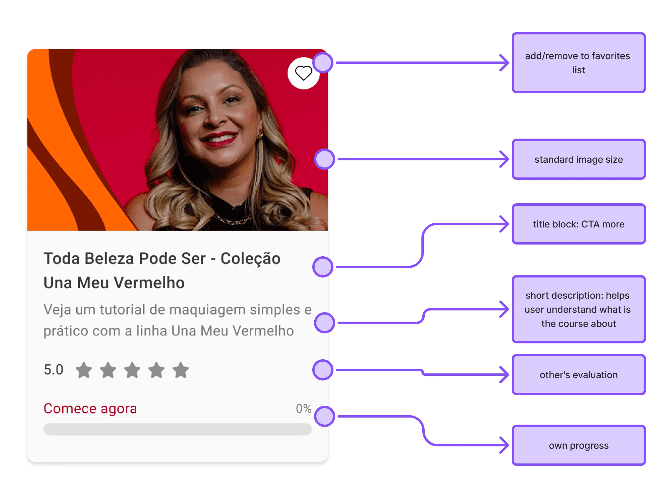
components: CourseCard
The course card was redesigned to fit with the Design System patterns - applying tokens the tokens, colors, icons e components. And it was also add a description to briefly presents the content of the course.
Virtual Classroom
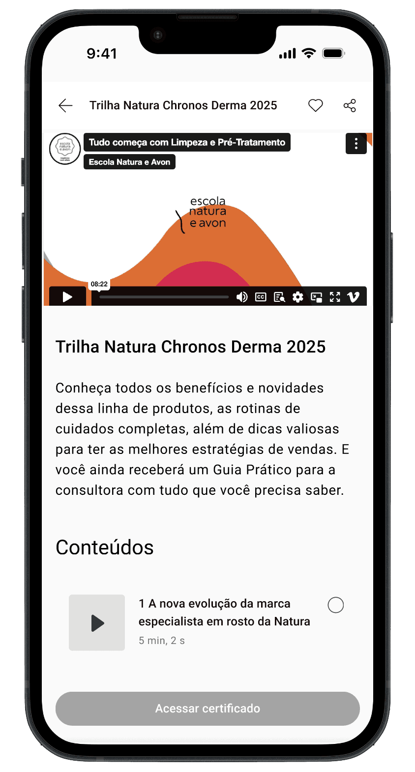
Virtual Classroom was redesigned to create a better experience in mobile device: all the content can be accessed in the same screen, by scrolling the page, without needing to click any button to find hide content or view progress.

Results
Customer Effort Score (CES)
+9,7 p.p.
Regular
Excellent (Very Easy)
Course completion rate
+20 p.p.
